

Using Global CSS
Learn how to style Clerk components using global CSS
Overview
Styling Clerk Components with global CSS stylesheets is a universal approach that would work with any frontend framework. Clerk provides classes on the HTML elements within the components that can be targeted with a stylesheet.
Usage
Open the development tools inspector and find the element inside the Clerk components you want to apply styles to. For example, the primary button on the Sign In form:
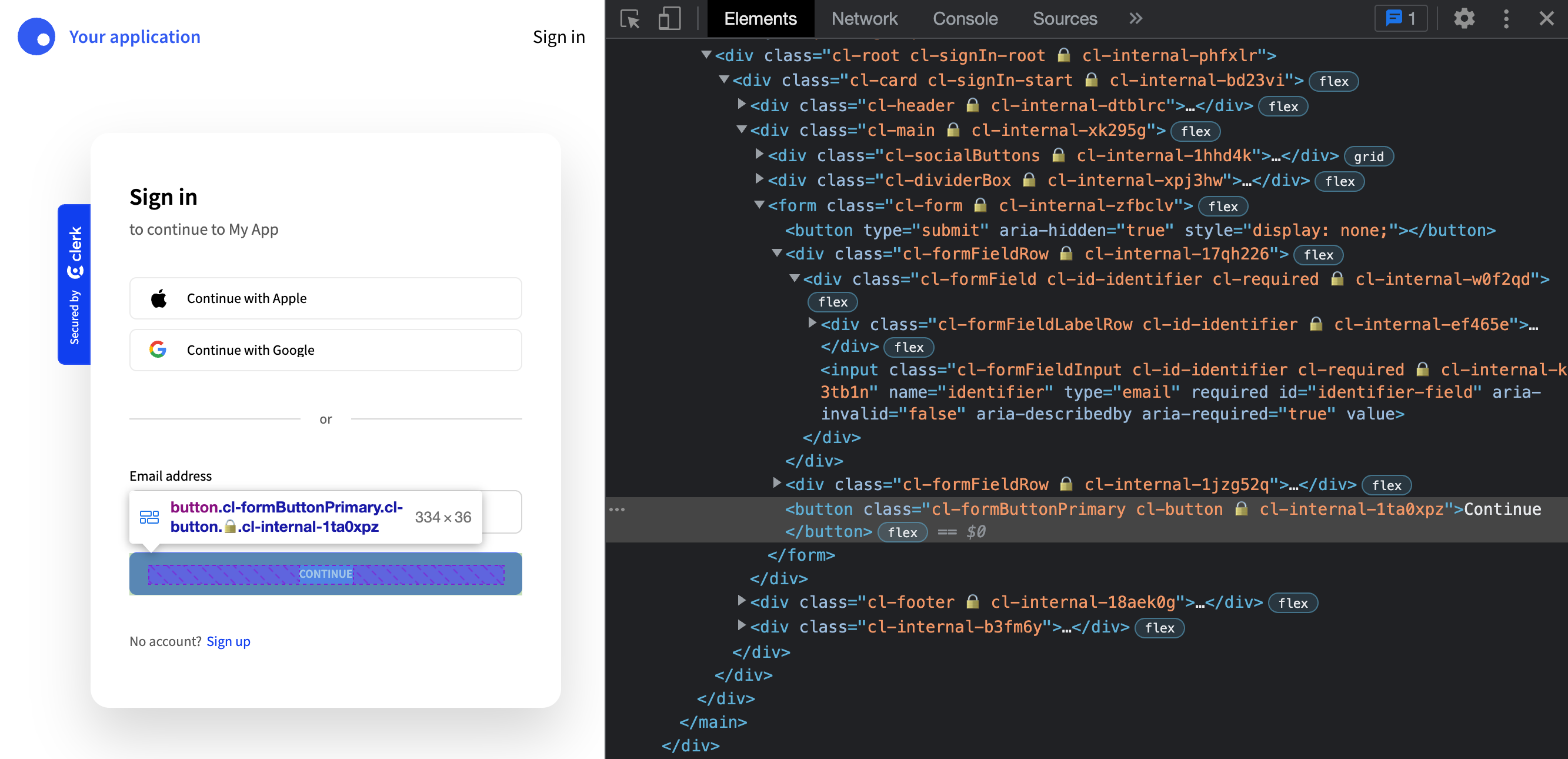
The element will have classes applied to it like:
cl-formButtonPrimary cl-button 🔒️ cl-internal-1ta0xpz
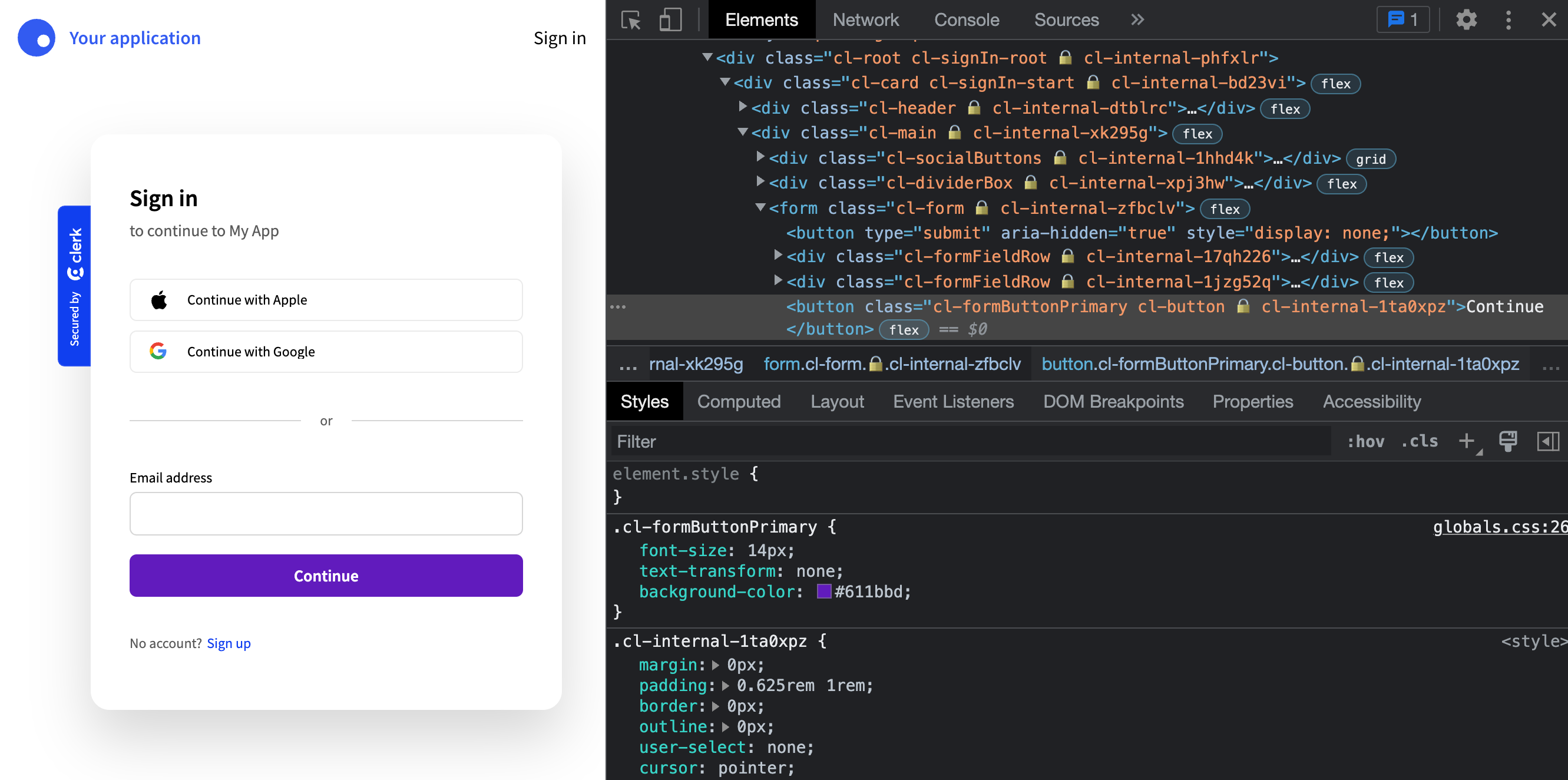
The classes to the right of the lock icon (🔒) are used internally and can be safely ignored. The main class to focus on for styling in this case is cl-formButtonPrimary.
Simply add that class to your own stylesheet, with the styles you'd like applied:
.cl-formButtonPrimary {font-size: 14px;text-transform: none;background-color: #611bbd;}.cl-formButtonPrimary:hover,.cl-formButtonPrimary:focus,.cl-formButtonPrimary:active {background-color: #49247a;}
Import your CSS stylesheet as you normally would and the styles will be added to the Clerk component.
With CSS Libraries
This approach of using global CSS also works with popular CSS libaries like Bootstrap and Foundation.
Instead of using the Clerk-provided classes (the cl- prefixed ones), you can pass the classnames provided by the library into the elements config of the appearance prop.
For example, you can apply Bootstrap button and text utility classes to the primary form button like so:
<SignInappearance={{elements: {formButtonPrimary: 'btn btn-info text-capitalize'}}}/>
You can apply your own custom classes using this method as well.